
The problem with 'S-curves'
The pseudo-scientific ‘model’ that dominates the energy industry

All industries have rituals; the cutting of steel (ship building), ground breaking (construction), graduation (education). In the energy industry one popular ritual is the ‘cheering and jeering of subsidies’. The ceremony is simple; the government of the day announces some form of support package for a project or technology, and the respective factions of the industry react with outrage or jubilation. This happens at least once a month, although perhaps more frequently of late.
The jeerers claim the subsidy is a waste of money. Whilst their preferred technologies have or are scaling up, the technology in question won’t be the same for various reasons (usually some higher order techno-economic law is invoked). The cheerers use their opponents’ argument against them; they claim that the technology in question is just like the other sides, just a little younger. With this helpful nudge by the state a new industry is set to take off and make Britain a global leader in blah blah blah. For the duration of the rumpus the factions self identify as the inverse of one another. However their differences are exaggerated. Both camps use the same framework for understanding technology: The ‘s-curve’.
What are ‘s-curves’?
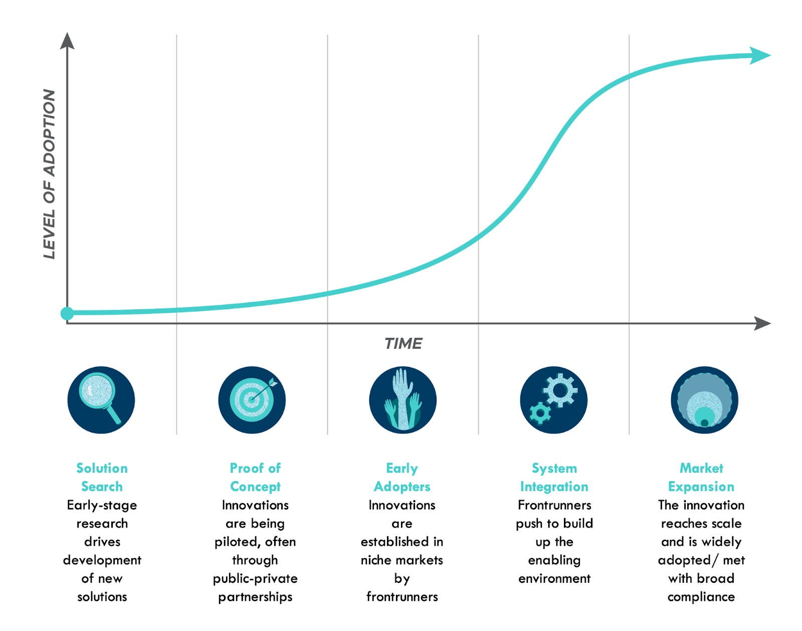
The idea is that technology deployment ‘typically follows an S-curve pattern of growth: slow at first, then rapidly rising, before flattening out again as they reach market saturation’ (see Rocky Mountain Institute and Figure 1). Some go even further and claim as an absolute that ‘the adoption rate of innovations is nonlinear.’ This is based on the assumption that innovations spread through diffusion. Initially there are a few early adopters that are brave enough to ditch an incumbent technology. But if the new technology is superior then others will follow. The new technology grows in popularity rapidly as people start to copy one another. Eventually the growth peters out because the technology saturates the population. In mathematical terms the s-shaped curve is neatly described by the logistic equation. The ‘s-curve’ is often conflated with the ‘learning curve’, which represents how the cost of producing things goes down as the cumulative volume of units produced increases. In theory a learning curve might accelerate or dampen the diffusion of a new technology, but an ‘s-curve’ can plausibly exist without a learning curve.
Figure 1: An ‘s-curve’
‘S-curves’ are ubiquitous in the energy industry. The old adage has it that you are only six feet from a rat in London. You are probably only six clicks from an ‘s-curve’. You find them in countless reports by international bodies, governments, and management consultancies. They have been buried deep. They sit inside the excel formulas on analyst’s laptops. Countless forecasts and business plans have been built on the back of ‘s-curves’.
‘S-curves’ are at the core of civilisations ‘strategy’ to prevent catastrophic climate change. The think tank Carbon Tracker summarised a common sentiment: ‘the energy transition may well be determined by the phenomenon of S-curves’. The ‘plan’ is for low carbon technologies to scale up along an ‘s-curve’, with fossil fuels falling away in tandem. A 2022 report by the Intergovernmental Panel on Climate Change represented the transition as a set of intersecting ‘s-curves’. There is something seductively simple about the image. Like many religious symbols it is symmetrical. In the same document another neat visualisation showed how various public policy instruments, including subsidies, could be used to encourage technologies along their ‘s-curves’.
Figure 2: ‘S-curves’ according to the IPCC.

Source: IPCC, Climate Change 2022, Mitigation of Climate Change, Technical Summary, Working Group III, Sixth Assessment Report of the IPCC.
Why ‘s-curves’ are flawed
The ‘s-curve’ is fundamentally a historical model in that it extrapolates from the past into the future. Where does the ‘s-curve’ itself come from? It was first developed in the 1920s by the biologist Raymond Pearl. A small number of fruit flies were placed in a jar with some food. Initially the population grew slowly as the flies adjusted to their environment and started to reproduce. Then their numbers grew rapidly, doubling at a constant rate. In the final phase growth slowed to a halt as the population reached the carrying capacity of the jar (the ‘K’ factor). The technical term is that the population converged on the ‘asymptote’.1 In a 1928 paper by Pearl the experiment seems to have started with a small number of flies and no food, and merely modelled how they died off.2 The crucial point is that in both versions of the fly experiment the ‘asymptote’ is known; the extent of the jar and the number of flies. Pearl went on to apply his model to populations of microbes, animals and humans. Like many other scientists at the time he was convinced that linear and exponential growth was not possible; there was a natural limit to the population a given ecosystem could sustain.
Fast forward to today, and there are two ways that ‘s-curves’ are usually presented in studies of technology. The first places the number of units on the y-axis, either the raw number or share of ‘market’, and time on the x-axis. In energy this is a very common way to compare electric and petrol vehicles sales. Or solar and wind vs coal and gas generation. In both instances we are still in the foothills of any apparent ‘s-curve’, so it is better to look at technologies that have reached so-called ‘maturity’ to see if the ‘s-curve’ holds.
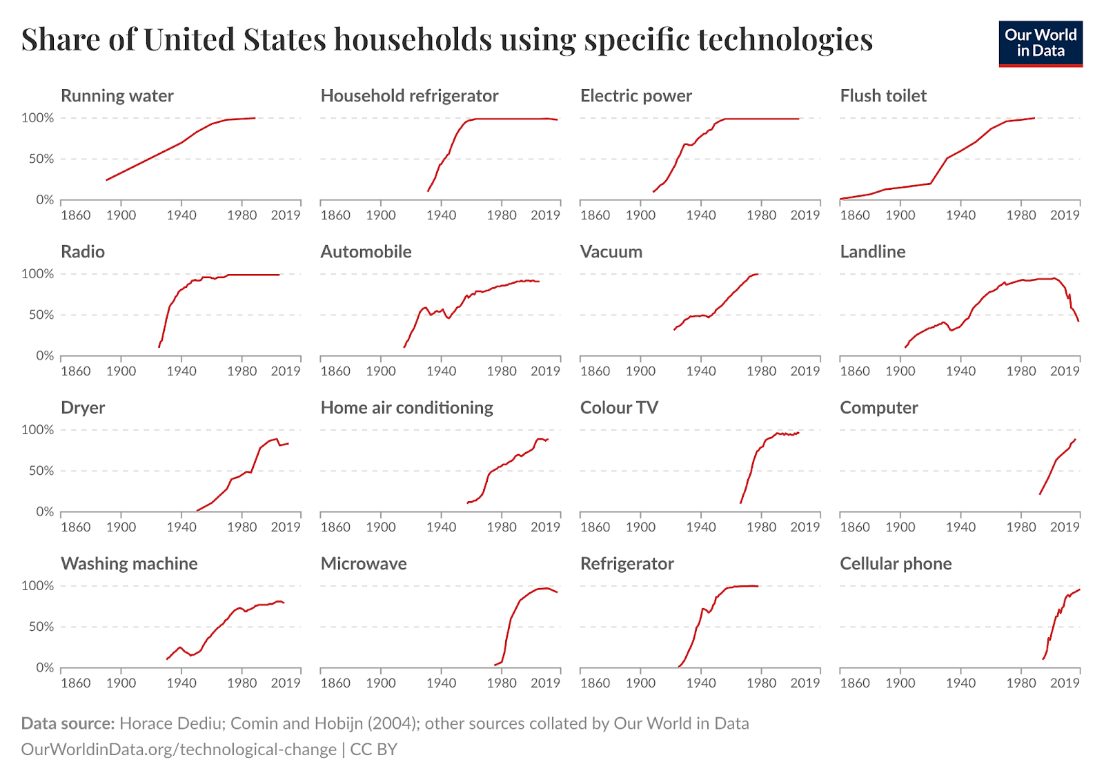
Figure 3 shows the diffusion of twelve technologies in the United States over the 20th century. Some have an ‘s-curve’ pattern (aircon, flush toilets, microwaves). However some do not. Some of the curves are linear and then slow down (e.g. radios and cell phones). Some are just wiggly (automobiles, landlines, washing machines). This of course suffers from survivorship bias. These are just the technologies that became ubiquitous. What about the likes of the minidisk, the TIVO, or the steam powered car? Data on failed technologies is hard to find so I don’t know what their curves looked like.
Figure 3: Share of United States households using specific technologies.
The second way that ‘s-curves’ are presented is by using the cumulative percentage of units of a thing on the y-axis and time on the x-axis. For example, showing the miles of canals in each year as a percentage of the maximum length of canals. This way of defining an s-curve is close to meaningless.
Take for example the influential work of Arnulf Grubler and Nebojša Nakićenović. In a 1991 article titled ‘Long Waves, Technology Diffusion, and Substitution’ the pair argue there is a regularity to the way infrastructure systems develop.3 This is a perfectly reasonable hypothesis but to prove it they torture their data. The article contains a graph showing the growth in number of miles of the canal, railway and road networks in the USA from 1800 to 1990 (figure 4). This visualisation shows three distinct curves, each with a different final extent and with a different shape. Only canals have a clear ‘s-curve’. The fact that the final length is different across the three is interesting. Maybe each technology built upon the last, getting more dendritic over time, like the branches of a tree? However Grubler and Nakićenović are looking to find regularity. So they transform the data by representing each curve as a cumulative percentage (see figure 5). Hey presto, this creates three near identical ‘s-curves’. The article contains a Freudian slip. With this trick ‘the sequence of the development of these three infrastructures appears… as a remarkably regular process when their size is plotted as a percentage of the saturation level’.
Figure 4: Growth of length of transport infrastructure, USA.
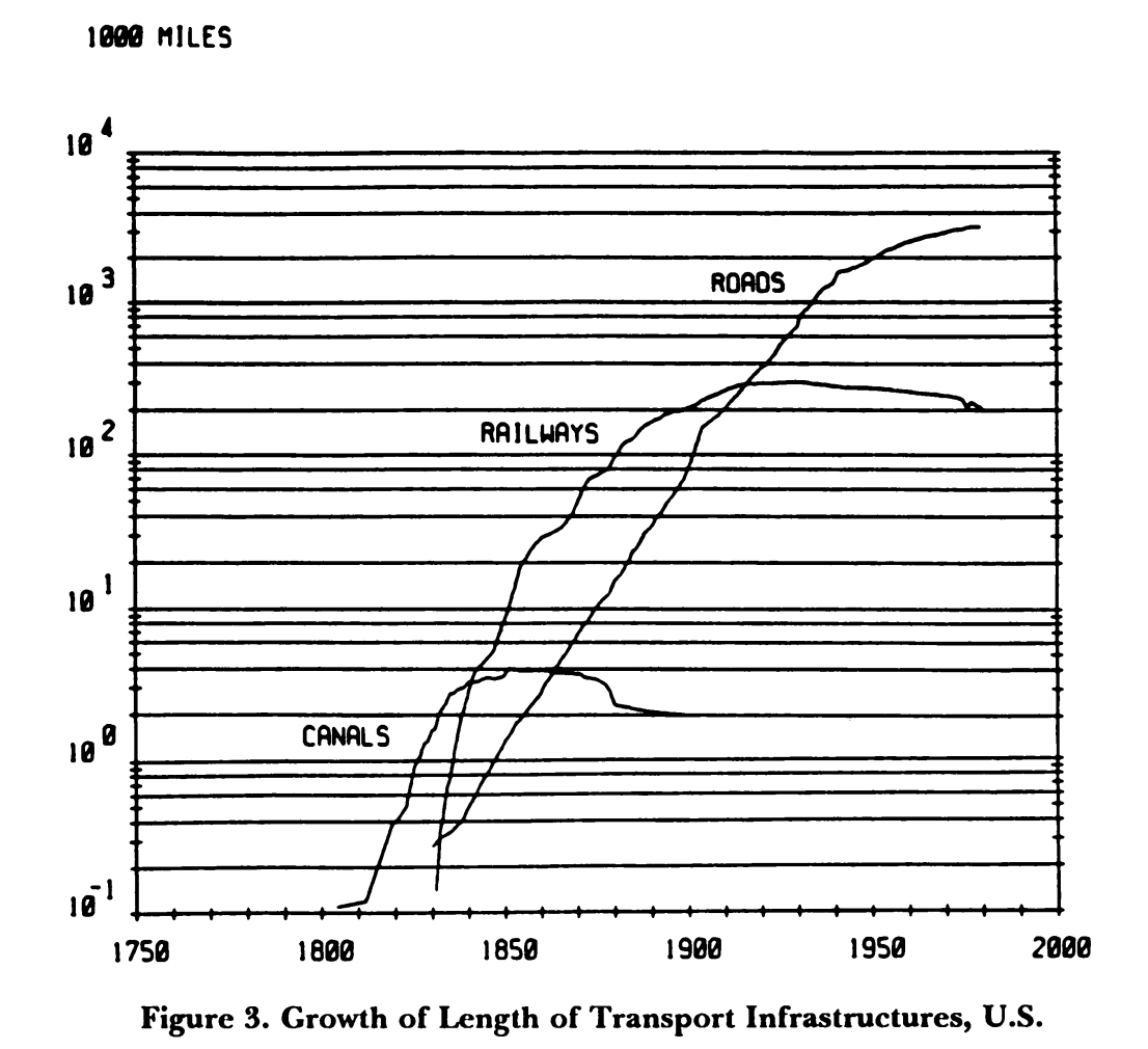
Source: Grübler and Nakićenović, ‘Long Waves’.
Figure 5: Growth of transport infrastructure as a percentage of saturation level, USA.
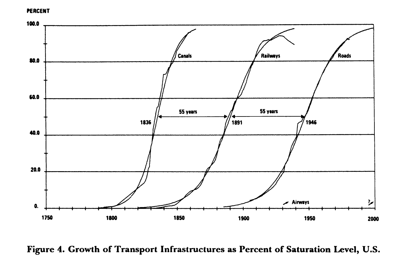
Source: Grübler and Nakićenović, ‘Long Waves’.
The term ‘saturation level’ is also revealing. It sounds scientific. It gives the impression that the maximum length of canals, railways, and roads in the USA was some kind of physical limit. Like the size of a jar containing flies. However if you compare different countries on length of railways per capita or per square mile of land you see very different ‘saturation’ levels. In 1920 Germany had more miles of railways per square mile than the USA. Why couldn’t the USA have had even more railways? Britain is supposed to have built too many railways, or at least that was the rationale for Dr Beeching shutting large parts of the network down in the 1960s.
Not only are Grubler and Nakićenović looking for regularity, they are looking for ‘substitution’. Take a famous example; that the car replaced the horse. Grubler and Nakićenović represent horses and cars as a share of the total ‘market’, which is taken to be the sum of horses and cars (see figure 6). (When someone tells you that you can’t compare apples and oranges feel free to reply that you can because some Professors freely add up horses and cars).
Measuring the process this way makes it seem like a straight swap. However another graph shows something more interesting. The number of cars overtook the number of horses in the 1910s and then continued to grow. To say the car replaced the horse is a gross understatement. It was both a substitution and an addition. Henry Ford is supposed to have known this when he allegedly said ‘If I had asked people what they wanted, they would have said faster horses’. Thinking about technology only in terms of substitution is dull. For a much richer account of how ‘old’ and ‘new’ technologies commingle, combine and compete I would highly recommend David Edgerton’s The Shock of the Old: Technology and Global History since 1900, Brian Arthur’s The Nature of Technology, and Jean Baptiste Fressoz’s More and More and More: An all consuming history of energy.
Figure 6: ‘Replacement’ of horses by cars, USA
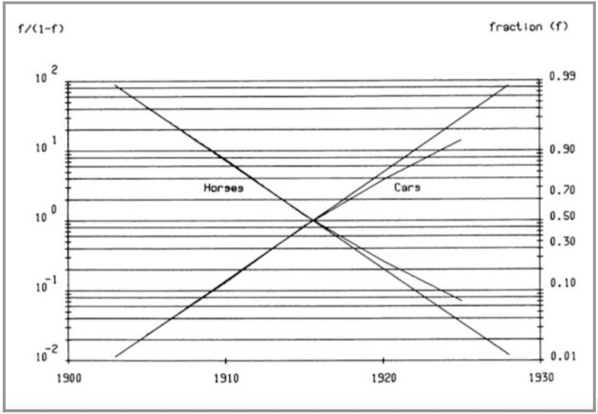
Source: Grübler and Nakićenović, ‘Long Waves’.
Figure 7: The number of cars and horses, USA
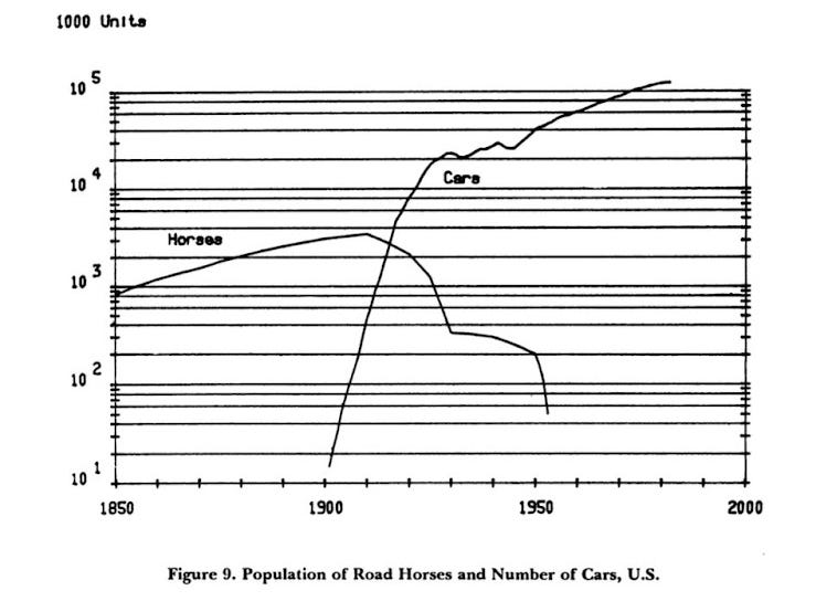
Source: Grübler and Nakićenović, ‘Long Waves’.
This pattern of substitution and addition is even more evident in one of Grubler’s other books.4 In it he examines the way people used different transport technologies in France over the 19th and 20th century. The picture is so much more interesting than a simple substitution model. When viewed as market shares, it seems like a set of classic ‘s-curves’ (see figure 8). Waterways and horses were replaced by railways then roads, with roads then replaced by air and high speed trains. However when measured by miles travelled the ‘s-curves’ melt away (see figure 9). Railways added to waterways. The decline in travel by horse was protracted from 1850 to 1910 and then very rapid. Travel by air, rail, road and TGV have grown in tandem.
Figure 8: Passenger model split in France using ‘fractional shares of passenger-km performed’.
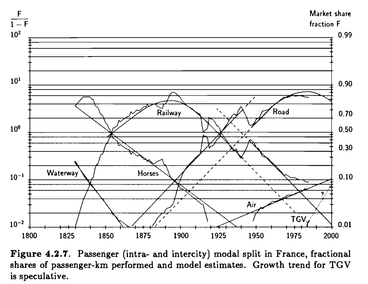
Source: Grübler, The Rise and Fall of Infrastructure.
Figure 9: Transport patterns in France 1800-1990.
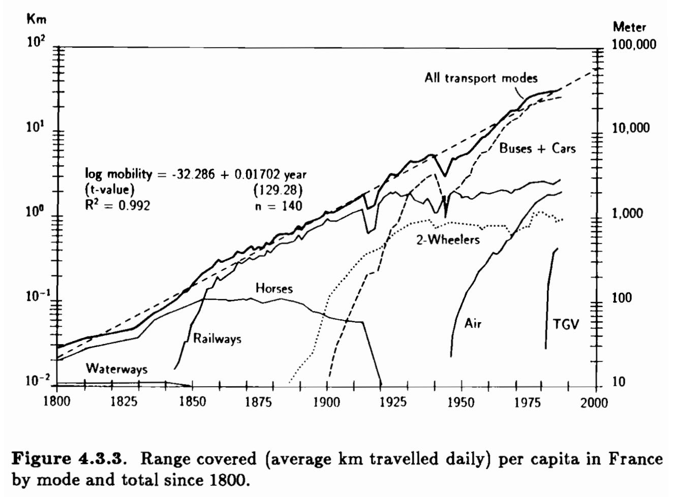
Source: Grübler, The Rise and Fall of Infrastructure.
In summary, the ‘s-curve’ is not a universal law for the development of technology. Some technologies develop along something resembling an ‘s-curve’ and some don’t. Constructing an ‘s-curve’ using the cumulative percentage method to compare different technologies is misleading because it makes the ‘s-curve’ seem more universal than it is.
Explaining the seductiveness of ‘s-curves’
How has something so superficial become so popular? In short, because anything can be plonked on an ‘s-curve’. It is the perfect example of an unfalsifiable theory. Advocates of carbon capture and storage, hydrogen, or direct air capture can claim their technologies are about to rocket up an ‘s-curve’. The lack of evidence of a take off is irrelevant. It is always about to happen. It is ‘Schrödinger’s exponential’: the rapid acceleration is both happening and not happening at the same time. The technology is in a state of indefinite potential. What is so enraging for the critics of these technologies is seeing their own successes being used against them. In 2022 an academic paper made the argument that various CO2 removal technologies would follow a similar trajectory to wind and solar, moving along an ‘s-curve’. The argument is barely distinguishable to that in a 2005 special report on carbon dioxide storage by the Intergovernmental Panel on Climate Change. As Nicholas Taleb says; we don’t learn that we don’t learn.
‘S-curves’ are a narrative device. They are particularly useful if you are trying to convince governments to part with money. The author can argue that the rapidly rising part of an ‘S-curve’ is always underestimated in projections and expectations. Therefore there is money to be made by those who come in before the uptick. The start, middle and end of the curve speak to different types of capital partners who want to put money in and then exit. The plateau at the end will be a great time to sell onto private equity investors who will see the potential to consolidate and sweat the assets.
The second reason why ‘s-curves’ are popular is because people imagine that you can use them to predict the future. However, knowing that some technologies in the past have reached mass adoption along an ‘s-curve’ like pattern doesn’t tell you about whether a particular technology today will do the same.
Imagine you are back in 1855 in the USA. At that point in time the railway network has been growing every year since 1830, but the canal network has not grown for a few years. Armed with the information about the annual growth in canals, could you predict the future development of the US railway network? Of course you couldn’t. And knowing about Georgian turnpike roads, Venetian canals, or Roman roads, would be equally as useless. Past ‘s-curves’ wouldn’t save you from doing the hard work of analysing the nature of rail as a technology, and using your imagination to make some informed guesses about the role it might play in the US economy.
This is what academics that use ‘s-curves’ do today. The economist Doyne Farmer explains it well in a publicly available lecture. He uses an ‘s-curve’ to forecast the development of solar capacity. However the forecast relies on making an assumption about the maximum capacity of solar in the future. ‘If one has a prior [i.e. a belief] about where the asymptote of this s-curve is, i.e. how big the petri dish is,… then one can make pretty good predictions’.
So you can use an ‘s-curve’ to make a forecast if you think you already know what the future looks like.
In the same talk Farmer explores the potential of using ‘s-curves’ to predict even without making an assumption about the asymptote, but admits that this holy grail has yet to be discovered. I am excited to see how this research develops and will happily reconsider my assessment of ‘s-curves’ in light of the findings.
‘S-curves’ aren’t necessarily any worse than other methods. All forecasting involves making an informed guess about the future. However the specific issue I have with ‘s-curves’ is that when presented the visualisations often give the impression that the modeller has simply ‘wound forward’ from the historical trend as opposed to having ‘wound back’ from an estimation of the future.
The third reason that ‘s-curves’ are popular is because they reinforce the belief that technological progress goes hand in hand with ‘markets’ and private sector firms. The notion of technological ‘substitution’ goes with the idea that technologies are in competition, and if only ‘the state’ would get out of the way and let the ‘free market’ rip then the best tech will win. For example, wind generation in Hungary looked like it was on an ‘s-curve’ until 2012, but then it stopped expanding because the state put in place numerous barriers. Defenders of ‘s-curves’ might say that the state was simply getting in the way of the ‘free market’ delivering an ‘s-curve’. But this overlooks that state subsidies were a part of the reason why Hungarian wind was on an ‘s-curve’ before 2012.
There is no reason to believe the ‘s-curve’ goes hand and hand with the ‘market’. In the USA canals and railways were built by private sector actors. However the roads were built by state level and federal governments. In the 1960s and 1970s the state owned gas industry in Britain converted millions of households from town-gas to natural gas. Figure 10 shows the cumulative percentage of households converted over time. Oila! It looks a lot like an ‘s-curve’.5 In fact it is more of an ‘s-curve’ than smart meter roll out, which has been undertaken by private sector firms and ‘the market’.
Figure 10: State directed technology diffusion - natural gas conversion, Britain 1967-1978.
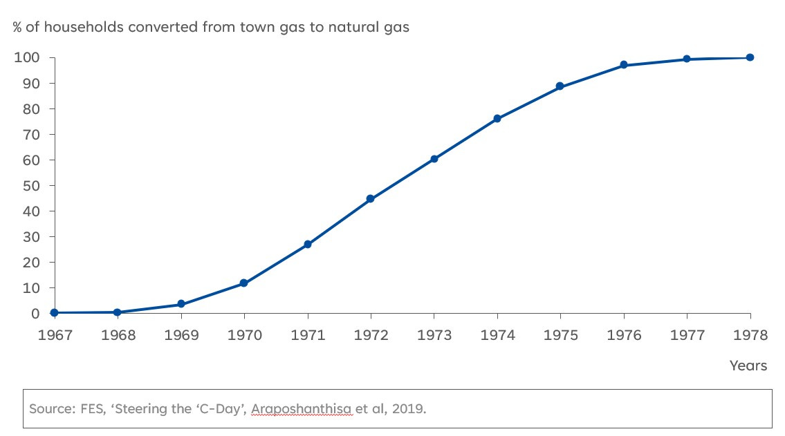
Source: Araposhanthisa et al ‘Steering the ‘C-Day’.
Conclusion
Over the last 30 years there have been numerous financial crises that revealed flaws in the complicated formulas used by banks. Defective mathematical models were buried deep in IT systems, regulatory standards, and investment strategies. Economists claimed the models were robust, lulling the industry into a false sense of security. Until reality proved that the formulas were nonsense.
This should be a warning to any industry of the risks of uncritically accepting the validity of popular models. ‘S-curves’ are not a law. They are just a heuristic. A narrative device used to tell a story. If you are determined to use one, take care to avoid two common mistakes. Firstly, assuming that one technology going up an ‘s-curve’ means another must be going down one. Secondly, do not pretend that the ‘saturation level’ or ‘asymptote’ was derived from the ‘s-curve’ if it was an informed guess. Informed guesses are fine, but it is best to be honest about them.
Jean-Baptiste Fressoz, More and More and More, pp.134-135.
Raymond Pearl, ‘Experiments on Longevity’ The Quarterly Review of Biology, Vol. 3, No. 3 (September 1928), pp.391-407
Arnulf Grübler and Nebojša Nakićenović, ‘Long Waves, Technology Diffusion, and Substitution’, Review (Fernand Braudel Center), Vol. 14, No. 2, 1991, pp.313-343.
Arnulf Grubler, The Rise and Fall of Infrastructure 1990.
I am using the flawed method to emphasise my point.
I was very lucky to spend a lot of time in my first job calculating S-curves (alongside learning curves).
It's *all*'about the assumption you make about the eventual saturation level.
You can get some idea of final saturation from the historic data (v rapid takeoff probably means a bigger final market), but fundamentally you have to take a punt on his big you think market will be once all the transients die out (hype, market development support, lack of supply chain, startup balance sheets, etc).
That's why the hydrogen ladder is about where the soil level will end up per end use might settle, after the unsustainable mountain of subsidy carrots has decomposed.
It's also a big reason why all the big official energy agencies' solar forecasts are worthless. As soon as you bury the wrong saturation level deep in your model (solar can never supply more than 10% of electricity because the sun doesn't shine at night) not only do you get the future energy mix wrong, you immediately get next year's solar market wrong too.
I looked at this in my piece on the "solar singularity" back in 2018.
https://open.substack.com/pub/mliebreich/p/linkedin-scenarios-for-a-solar-singularity
I suggest one looks at s-curves from 3 perspectives.
1. Technology
2. Economics
3. Politics and belief systems.
So with solar the underlying technology is made in a factory and assembled on site. (Prof Bent Flyvberg) So limitation to s-cuve is economics. The 30/30/30 policy of Australia (30c/W installed, 30% efficiency and by 2030) means wholesale cost of $au20/MWh.
So the framework to be s-curve is in place. Politics will either increase or decrease rate. No barriers to end. Enough roofs, so even land not an issue.
Contrast that to CCS or H2. Both have no visible technology pathway (yet) to be at that price point). So only politics or belief systems. And ignoring competitive technology.